
Wednesday, 10 November 2010
3ds max space ship
Wednesday, 20 October 2010
3d animation in 3ds max
Today I made my first animation in 3ds max, I used my name that I made earlier and used the bottom bar frames on 3ds max to create a key frame, once I did that I move my name 360degrees and added another key frame further on in the frame bar so it would be animated I did this a couple of times to make the name get bigger and smaller. I also added a ball which bounced down near the end of the animation, the ball bounces a few times before falling through the ground.
Using text, fonts and material editor in 3ds max
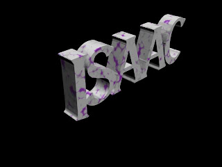.jpg) <---- This was my favourite design I made.
<---- This was my favourite design I made.Today I had to write my name in 3ds max, first I when on to the shapes tool and chose text, below that was a box to type your text in then move it onto the screen. I also changed the font of the text, once finished with the font I converted it into an editable mesh and selected the whole name, so that I could extrude it out to make my name 3d.
I wanted to change the colours of my name so it would stand out more, to do this I pressed "m" on the keybored which brought the material editor up. I started to make different colours and added them together, then pressed the little box next to diffuse to give the colour an effect, e.g. smokey and checkers. Once I did that i began to change the colours to give the text the best possible look and make it stand out the most it could.
I did three different designs for my name that I though looked unique and authentic. I finished the designs then rendered them and saved as a jpeg.
These are the designs I came up with:
.jpg)
.jpg)
Tuesday, 19 October 2010
Final desktop Image and final desktop after Improvement

To make this desktop design, there were many stages that I had to undertake.
First I found 4 pictures of images I found on the Internet that I liked to base my idea around. Then I annotated and drew all four pictures and chose the one that appealed to me the most.
Once I chose the image for my desktop I drew it on A3 paper and made some changes to the image to make it better. Then I Scanned it onto the computer and began to colour and edit the image in Photoshop. I gave the image a background which made the image stand out more then changed the colour of the flowers to suit the image. I also used bevel and emboss to give the flowers shadow and make the image look more appealing.
Once finished with all the little tweaks I added the Shipley college logo and the media suite logo in too, I also added the main rules of Shipley college in the desktop image. Finally I changed the font of the rules to make it look more effective and stand out, then I saved the image as a Jpeg.

To make my desktop design better I added more meaning full words to the picture to add the rules of the college, I also changed the colours of some of the words to make them stand out more, because they were blur ed when I used it as a background.
I also added to the colour shading of the image itself to make the flowers look more appealing, and it is easy to see that more attention to detail has been added.
Evaluation of final desktop image:
Does the end product match your original intentions?
I believe that my final design matches my original intentions, I wanted to do something with Japanese art and chose cherry blossoms as the theme for the desktop. Once I had chosen the image for the blossoms I changed the image around and made it my own. I paid a lot of attention to detail in my design and spent a lot of time designing the finished product on paper before moving it on to the computer. In conclusion i think it all when well and the final outcome was more or less exactly what I hoped for. Everything was done in photoshop, once I put the picture on to the computer, I changed the colours of the flowers and made a background using the paint tool on photoshope.
Is the end product appropriate for your intended audience?
There is no vulgar language in my design and I know that it is appropriate for all ages, so I believe that it is defiantly appropriate for my target audience. The image is very appealing and I feel that people of all ages could find something they enjoy about it.
Discuss the technical aspects of your work and highlight the strengths / areas to develop
I had a fair bit of difficulty getting use to using layers and duplicating the layers to add improvements or tyring things out. but apart from that I think I did a fairly reasonable job, I especially like my Japanese cherry blossoms which I spent a lot of time trying to perfect.
Discuss the content / style of your work - ideally this should relate to your research
I made my desktop in a Japanese anime/manga design, I used Japanese cherry blossoms and Japanese symbols in my design to add to the style of the desktop. I also added the shipley college logo and the media suite logo. Within the design i added 6 different rules of the college that the class felt was appropriate to use.
After all this i added a background to the design, the final background was actually a mistake, whilst I was playing around with different background styles, I made this pattern above and I stuck with it.
Finally...*If you had the opportunity to make this product again would you do anything different? And are you happy with the overall product?
If I made the desktop again I would improve the colouring of the flowers and work with shading more to find better contrasting colours, apart from that everything i did was exactly what i wanted and I wouldn't want it any other way, I thuraly enjoyed doing the project and am fairly happy with the overall outcome of the entire project.
Thursday, 14 October 2010
3ds max Truck
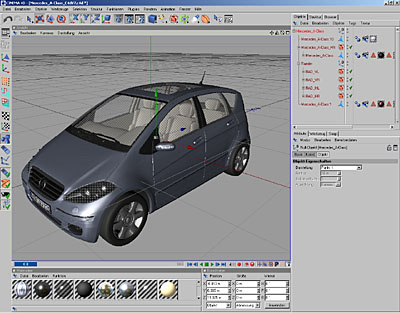
I made a truck using 3ds max, with the same principles as my last post but unfortunately was unable to finish the truck itself was extremely well detailed and I added exhausts and a horn on the top of the truck I also lowered the back of the truck to make it look realistic. Here are a few professional 3ds max cars and trucks that I thing look really good, authentic and are some of my favourite cars:

This is a car made by professionals in 3ds max, as you can see this would be extremely hard to make and design and would have taken a long time to get every detail perfect and to do the interior must have been really hard to do. This car looks really good and has every detail pitch perfect.
This car is also very detailed and well done, its obviously it was done by professionals and would of been extremely hard to make also the interior is very well done and must have taken plenty of time to make and design.
Wednesday, 13 October 2010
Car in 3d max

Tuesday, 12 October 2010
Thursday, 7 October 2010
Robot using 3ds max

Logo Research
Today in PSD I looked at logos of equality and diversity and picked one I found was best to express how everyone is equal. Then using photoshop I copied the image over and began to make suttle changes to the logo, using the pen tool I went over the shape of the two hands that were shaking, to edge off and smoothen the outer layers of the hands then I deleted the rest of the background and began to make the logo my own. I changed the colour of the background and added effects to it so it would stand out and make the logo stand out above all.Then I added flame designs to the logo to add more of an effect and make the image stand out.
These are some images of professional logo designs:
 This is the logo from my favourite anime called bleach. The logo itself is very dark and i like the way in which it enphasise the emblem and words in the logo it is very effective and stands out.
These are some images of professional logo designs:
Tuesday, 5 October 2010
Desktop Wallpaper Design

I drew 4 different designs that I got inspirations from by searching through google and looking at different desktop designs and other images that suited my personal feeling. These designs were anitated from the original and drawn in the way I saw them. The designs that I were drawing were to be used as a desktop image. It had to include the shipley college logo, the media suit logo and a few college rules the class felt was most important to include in the desktop.
The first design I did was of a koy fish I found a picture of one on the Internet, I copied the picture and made a few changes. Around the fish are flowers to symbolise the beautie of the koy.
The second design was of the yin yang symbol. I also found this picture on the Internet, I printed it out and copied it out changing certain aspects of the design by adding an additional circle around it with a semi circle pattern around it to make the yin yang symbol stand out.
Thirdly, as I'm abscessed with most things Japanese and I love the manga bleach I chose to do a bleach design for the desktop. I found an image of a mask form the manga and drew it out then added colour to make it stand out and to emphasise the darkness and nature of the mask.
Finally I found a picture of a Japanese cherry blossom on the Internet and then drew one of the petals, after that I traced it and then flipped the image over so it reflected. Then I added the Japanese symbol for respect as the centre piece and placed the shipley college logo at the bottom. I chose this picture to use as my final design because I love the Image and it looks peaceful, which will hopefully transfer to other people when they see it on a desktop, It also has meaning as it has the rules of the college around it and the Japanese symbol for respect in the center of the drawing.

Thursday, 30 September 2010
professional 3D modles
This is my favorite professional 3D model, I particularly like it because its from the film Lord Of The Rings trilogy. I like it because it looks authentic and realistic and I hope to one day be able to create things of this magnitude myself. Its very well done and takes allot of time to make and is done by teams of people but the end product is brilliant. This is the model of helms deep:
http://www.exceedingthelimits.se/portfolio/?p=679

http://www.exceedingthelimits.se/portfolio/?p=679

3D castle in 3ds max

I first started making the castle battle tower and using the editable mesh to shape and try to imitate a real life Castle, once finished i duplicated the tower 4 times as to create the four foundation points to my castle, after that I made a wall with archer stations. I also duplicated this wall twice for two sides of the castle, I didn't duplicate four times because two of the walls were smaller than the other two so for them I had to make a new wall using the same principles as the first one, using the editable mesh and a taper to curve and shape the walls. once finished with the outer layer of the castle I started on making an entrance to the fort I deleted part of the larger wall in the centre to make an opening then created a draw bridge using the box tool.
I then added sides to the bridge to create the elements of a mechanism that would lift and drop the bridge, unfortunately this was as far as I got as I ran out of time, But if i had time i was going to create a hugh buliding inside the castle walls, it would have looked like a palace, a place were the a king would live.
Wednesday, 29 September 2010

Tuesday, 21 September 2010
Unit 19 desktop genre collage

I had to find specific pictures for each type of genre. So that the collage was efficient enough to serve its purpose. Said collage included pictures of popular games which included, Viking, Alien vs predator, ninja gaiden and ofcourse Call of duty modern warfare. This gave lots of variety to the collage and helped singeling out each genre and type of the game.
Thursday, 16 September 2010
Favorite 3d gaming models
These are some of my personal favorite in game pitures of games I enjoy to play, and 3d models of characters in other games I love.
This is a picture of Fable 2, the 3d model character that you play as in the game is fairly realistic and is well done thier is alot of detail gone in to the making of the character and is very unique in comparison to other computer controlled characters which are also very well done. the landscape and content in game as you walk around is very graphic and detailed their are cracks in the road making it look how roads would have look during the era of the game., Its is all so well thought out and realistic in the fact that days turn into night and weather changes, this makes the game have more feel to it and more enjoyable for the player allowing the player to feel emotion thus making it feel as if your in the game. 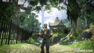

This is an in game snapshot of Modern warfare 2, and the character modeling is very well thought out and has a sense of authentisity to it because it looks real and detail is key. The way the character moves and you control it looks how the SAS would move and react in real life senarios. The models gun is also authentic and realistic, and reacts how the real gun would e.g. recoil. The maps/ landscapes and surrounding and well though out and planned, and are very accurate to real places, and how detailed the surrouindings are with bullet holes in the walls and being able to make bullet holes in the wall is a very nice and realistic to real life warfare, making you nerves to run out a of a corner and into the line of fire, moments like that are assentional, because it makes the player belive that they are in the game and react when seeing an enemy. This makes the game more enjoyable because all these elements make the game unique.


Wednesday, 15 September 2010

Brief
Im currently taking a BND game develpment course in the hope of working for a high up games company making and designing games, e.g. Lion head or Ubisoft.
Subscribe to:
Comments (Atom)