Tuesday 29 November 2011

Analogue Overview

Today our class looked at how analogue is very different to digital and arguable better.
Analogue is a physical form of transmitting sound, its bandwidth is unlimited and uses vibrations to send sound, where as digital has a restricted amount of bandwidth available. There are many different opinions when it comes to which format is better to display sound and both analogue & digital have there strong suits e.g. digital has a longer expiration date than analogue, but analogue sounds warmer to humans which is why many thinks its better.
The different types of analogue signals we looked at where vinyl records made with aluminium & magnetic tapes, but there are many other ways in which to transmit an analogue signal e.g. Televisions & ultrasonic devices.

Tuesday 22 November 2011

Trailer Analysis- Planning the team trailer


Our team was asked to create a mind map of our ideas for the trailer we will shortly be having to make i 3ds max. We started talking about the setting of the trailer and decided a futuristic post-apocalyptic zombie outbreak was the best solution. We also talked about the featured we would include within the trailer e.g. sound effects (gun shots, zombie noises), sound track, we also need to include a title screen, end credits, age rating, team logo ext. the trailer would take place within salts building
 We briefly talked about the plan for the trailer, here is a brief idea of the trailer. We starts in modern day saltaire, the power goes out, we look for solution, end up in a time traveling elevator which sends use to the future saltaire, from there things take a dark turn.
   The trailer will feature the entire team, along with Sir Titus Salt.

Sound Lab- Creating sounds

Today in the sound room we learned about how sound is used in games and films through the use of sound effects ext, to create dramatic effects and immerse the player/viewer fully in which ever media they are experiencing. We also learned how the effects in films and games are created, they do this by getting real sounds within day to day life and transform then using sound editing software, making the effect move fast, slower, higher & lower in frequency and also play with the bass to give added effect. Many people find however the best way to get the most realistic effects is to use what is know as a "Foley artist", these our the people behind the scenes who create the true immersion within the chosen media. Using real people to create the sounds give a more life like feel to the effects, without them sounding too over the top, they create there effects in a manner of ways from hitting apples with sticks to create realistic connecting punches to hitting a watermelon with an axe to create a realistic blow to the head from an axe. Without these unique skills immersion into media would be no where near as imaginative and truly brilliant as it is.  

Tuesday 8 November 2011

Songs and how they effect you

A song can make a person feel a manor of different emotions whether it be happy, sad, mellow whatever you listen to, songs have a massive impact on peoples lives and depending on what a person listens to can tell a lot about there personality.  
   I was asked to find a few of my favorite songs and express how they make me feel, so here they are:

Ron Pope- A drop in the ocean
http://www.youtube.com/watch?v=3LCBkkSdjEo
This song is very deep and emotional, it means a great deal to me as I feel i can relate to the song. The quick summary of the song is that he loves a woman completely, but she doesn't feel the same way, the singer expresses this through the lyrics "a drop in the ocean, a change in the weather, i was praying that you and me might end up together, it's like wishing for rain as I stand in the desert and I'm holding you closer than most, because you are my heaven".

Tuesday 18 October 2011

Questionnaire Results

Our class was divided up into groups and asked to produce a questionnaire in order to find out what the general public would look for in an interactive representation of saltaire in a 3d environment. My group consisted of Myself (Isaac Parker), Oliver Shillingford, Alex Ejraee, Alex Jeffery, Joe Lee and Joshua Williams, we had to take our questions to the streets to find out the peoples opinions.     
     Our results show that the majority of people where between the ages of 17-20. We had an equal amount of males & females who answered the questionnaire, making a total of 28 people. According to our statistics the bigger percentage of people preferred the arcitechture and history of saltaire and would prefer a Futuristic or present representation on saltaire in a 3d environment.
      Most people knew a bit about the history of saltaire with a statistic of 18 out of 28 knowing a little, only 7 knowing a lot and only 3 people who knew nothing. Out of the 28, 21 thought that an interactive environment would help educate people from and about saltaire. With the majority of people wanting Roberts park and the Church as the main points to include in a 3d enviroment.
     Based on the results collaborated in the questionnaire we found that most people preferred first person games rather than 3rd person, Adventure games and RPG's (role playing games). Out of these 12 people would perfer to play there games on the Xbox 360, 9 on the playstation 3, 12 on the Nintendo Wii, 12 for the PC and only 4 for handheld gaming consoles.

The Robinsons group is an arcitechtural company that designs and creates 3d models for projects they are going to create or are designing for a company, to see how they will look when built. Established in 1999 in the silicon valley of west Yorkshire. They are very devoted to there work and are always bettering the quality of there work with the latest technology and software.

Tuesday 4 October 2011

Winged Cobra logo

This is the my final design which I made in photoshop for the team logo and name, unfortunatly it wasnt chosen as the actual team name and logo. Never the less I feel I did a fairly good job, and it looks quite good all round. I got the font from a website called 1001fonts.com. The font type is called riky vampdator, I used this font becuase I felt it looked really good and stood out. It also makes the logo within the text look really unique and awesome, in my opinion ofcourse.
  Origionally I was going to have the winged cobra at the side or in the background of the name, but after a few alterations to make the logo look better I decided it looked best in the middle.
In conclusion I feel that the end product looks great and is what I envisioned my Design to be, I think if I had more time on the project I may have added more features, but I believe it looks better as it is, not to basic but not to in depth, and with the white background it really makes the logo stand out.

Ideas for Logo and team name


The class was split into team of about six people and was asked to each come up with a few different names for the team as well as each design a few different logo ideas for there chosen names. We then were asked to chose the best idea for the team so that they could be made and put on to T-shirts for the team.     My team was comprised of myself, Oliver Shillingford, Alex Jeffery, Alex Ejraee, Joe lee and Josh Williams. We each came up with our own ideas, and decided that we would each decide which name sounded best for each person, then with those names we each set out to design a logo for that specific name.
The name ideas are as follows:
Isaac Parker (myself): Winged Cobra
Oliver Shillingford: Team Kronic
Alex Jeffery: The Wolf Pack
Joe lee: The Action Six
The reason there were only four names to chose from was because two of the team was absent that day.
 My Ideas where as follows: Winged Cobras, White lightening and Cryogenics.

Here are my designs:


Once I decided that "Winged Cobra" was my favourite chose, I began to design some different logo's with that name: 


And finally my final design Idea:


Wednesday 15 June 2011

A space scene Animation

This is the animation I made for a project our class was given. There were no specifics as to what the animation had to be about, which help a great deal as I wasent trying to create something someone has told me rather we were able to create something entirely independent and something that relates to use as people.
   The reson I chose to create a space scene was because ever since I can remebemer I have loved all things to do with the universe and have always been astounded by whats out there. When i was given the chance to create this animation I knew isntantly that I wanted to create something to do with the space. I feel that the whole process of creating this animation went well even though challenges did occur, i was able to tackle them with ease and evetually ended up with something I'm quite pleased with considering this wa smy first big animation.
    I went for quality rather than quantity with this animation but unfortuanalty the quality can not been seen as the rendered avi file, is not the best quality itself, there for all the effects i put into the animation e.g. the sun look kind of tacky and rubish, however I will also put a rendered jpeg of the animation on the post to show you how it was supposed to look.
     Once the animation was finished I put it together in windows movie maker, as there were 3 different camera shots in the animation I had to render each one indavidually. I also added some effects using movie maker e.g. added music and effects for when the camera shot was changed. 
Overall there were a few challanges with this animation, but you must face challanges sometimes in order to achieve maximum potential as a challenge pushes you harder to achieve.
Well this Is my animation I hope you enjoy and thanks for reading 

Tuesday 14 June 2011

Evaluation of storyboard for comic strip

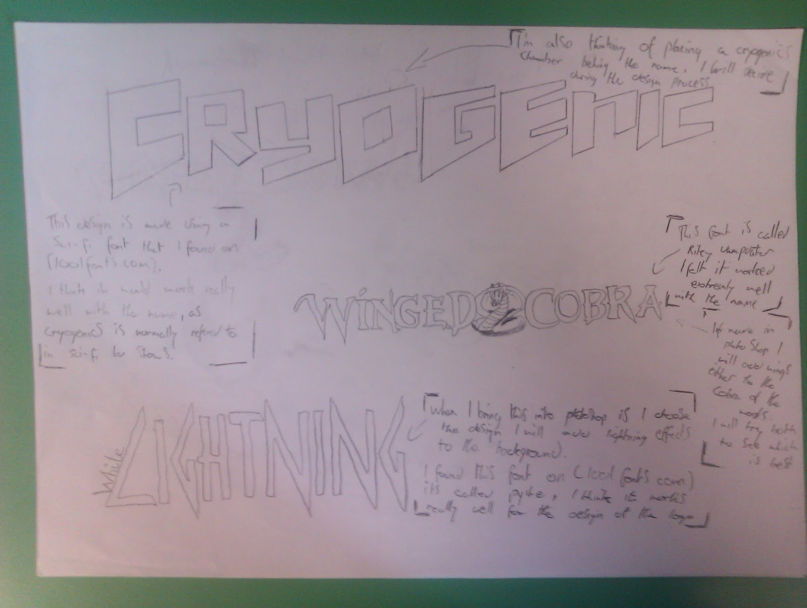
I where asked to create a comic strip using a favourite character from cartoons or anime and placing them in the comic strip completely out of context. Of course the character/s will have to altered so that I was not in breach of copyright e.g. colour of clothing, fair accessories ext.         
        This is something I did on photoshop a while back which is a rendition of what Byakuya is supposed to look like -
-This will be coloured differently so that copyright will not be breached 


          I first began to brainstorm a few ideas on what the comic strip could be about. Once I had decided on a wild west style comic, I then chose a character from the anime/ manga "bleach" called "Byakuya", he is very noble, a leader of one of the four noble famalies and is well respected in the world of bleach. He is also my favourite character so when this opertunity came up i jumped at the chance to create an out of context comic strip with him in it. However In order to be able to create the comic I first had to practise my skills at drawing byakuya.
I decided to use Byakuya for my comic as I feel it is definalty putting out of his comfort zone "so to speak", when I came up with the Idea for using byakuya I knew that whatever I did had to be completly out of context to bleach, so I thought what better way than to but him in the wild west. In my opinion compared to bleach, the wild west is the most out of context you could possible be.
      The storyboard was the hardest part of the entire process as my skills at drawing arnt exactly amazing, but I did the best i could with the skill I had. The storyboard basically shows every step of the comic strip and what is going on during the scene.
                                        Here is said storyboard-


    I then began on making a few backgrounds of Photoshop for the comic, I did this using images from the internet and combining them together to create my own unique image. This took me some time perfecting them and trying to get all the images to work together and look professional. I used a number of different tools in order t do this e.g. burn, smooth, blur and so on.
The next two images are of said backgrounds:

Once the storyboard and backgrounds were finished I scanned the images onto the computer and got to work on the images in Photoshop. It took me about 2 hours to colour each image, add background and extra's, some of the pictures look really good but others arn't the best. I guess this is just becuase my skills in Photoshop arn't exactly proffessional and I need to spend more time on it in order to achieve greater potential. There was also the fact that time was against me, as I had missed a good 2 hours work due to illness, also I knew I really had to get to it. In the end I think the comic strip looks quite good and I'm happy with it but feel that if I had more time and it was made using more time management instead of rushing it could have come out a lot better.

In conclusion I'm happy with the outcome although could have gone a lot better, I should have managed my time more wisely and spent less time on the minor details. I dont think I would perticularly like to do this again, as it was very strainiouse, time consuming and i didnt find enjoyment out of it, but then again maybe this was becuase of the rush. if I were to do this again I would manage my time and set my self deadlines for seperate tasks within the production.

Thanks for reading,  here is the comic strip: (side note the character in my comic was not created by me rather a re-imagination of byakuya- all credit goes to tite kubo and the makers of bleach),(anime girl in section 8 of comic strip was originally taken from- http://xobabiihoshiiox.deviantart.com/art/anime-girl-head-157792554 but I added changes and changed the colours of the entire picture)
  This is a profesional example of a comic strip, this perticular comic strip is from the manga/ anime called "Bleach". Which in my opinion is the greatest animae of all.

Thursday 9 June 2011

Making a space scene in 3ds max


This is the animation that I found on youtube.
made by:

I was researching for a tutorial on how to create an authentic looking sun in 3ds max and instead found a tutorial for a space scene. Intrigued by the name of thew animation I decided to take a look and ended up watching the entire video,afterwards I decided I would give it a go.

This is my attempt at recreating the animation.To do this I had to follow the tutorial precise and accurately and even then I had many problems and the end result was not what I had hoped for never the less I'm happy with the outcome though I would have changed some elements of the animation if I had the time.

The make this animation I used a number of different elements of 3ds max I never new existed, thus opening a whole new world of 3d modeling and animation to me, so I new I had my work cut out for me. I began by creating a sphere on top of a sphere and added textures to both, the first was a map of the earth and the second bigger sphere was textured with a cloud map. Doing this made the sphere look exactly like earth and with the clouds it looked more realistic. Then I created a camera and added an atmospheric effect called V rays to the camera lens, by doing this it created the image of a sun in the top right corner. After playing around with the colours, brightness and camera effects I was happy with my sun.
     I then added a star field to the animation so that it really was a space scene. Finally the scene was set and all I had to do then was animate the camera moving slightly south west, I also added a shaking effect to the camera for added effect. In doing this the problem occurred, looking back its not much of a problem. The camera shuck to much, but my friends persuaded me that it looked fine, so I left it at that.
   In conclusion I feel that considering I only spent 2 hours making the animation, it was fairly good for my first time. If i ever try this again I will consider using different effects of adding a spaceship to the scene. Overall I'm happy with the outcome but would rather not have to try make this again as it was very strenuous and aggravating.


Wednesday 8 June 2011

Examle of professional 3d animations

This is a video of professional animation from the game Might & Magic heroes 6. The animations are of a extremely good quality and must have taken a fairly long time to make depending on how big the animating team who made them where. There are great amounts of detail used in the flow in movement of the models as well as the texturing all are to a high standard. Of course my capabilities of animating arnt at this level but i can only hope that I can make something of this caliber eventually. 

Thursday 14 April 2011

bouncing ball animation

Although my other animations are better than this, our class were given a tutorial on how to animate a ball bouncing. The animation was very basic and only took a few minutes to do, this is how I did it.
First we had to make a plane and a sphere, the sphere was used as the bouncing ball, in order to animate it, we used the auto key and plotted a course for the ball to follow by moving the frame line at the bottom of the screen, at then moving the ball down or up depending on how far through I was. I repeated this motion for about 200 frames, moving the ball up and down. I also made the ball spin to give it more of a realistic feel. Once I had finished doing this I hit play and the ball bounced up and down gradually the bounces would be come smaller until the ball came to a halt, this gave the ball more of a realistic look, as physics where implemented, as the ball bounced it would loose energy so the ball would bounce less. I also added a spot light, to create a shadow on the ball, and added fog to give the environment an atmospheric effect.
This is what I came out with:

Wednesday 13 April 2011

Byakuya from bleach

For one of my classes units we have to create a comic strip, and have a character from a cartoon or anime placed in the comic strip and make him completly out of context to what he is like in "Bleach". I first printed a few pictures of byakuya off from the internet, then attempted to recreate the pictures by drawing them myself. (This is so I can get used to drawing him and texturing him and the background for when it comes to making the comic strip). I then scaned my drawings onto the Photoshop, I then began to colour Byakuya and try bring him to life. I also added a background to make to image look more atmospheric and apealing,
 This is what I came out with:

Image Taken from- http://www.dragoart.com
The original:


My attempt:


My attempt with colour:


Finally I added the background:

space ship model in 3ds max


I made this spaceship using the software called 3ds max, the project on the hole took along time to be even close to finished. As there were many aspects needed to be taken into account before I even touched 3ds max.  firstly  I had to produce a PowerPoint featuring different concepts for a vehicle, I did this using a diagram and choosing 3 different types of vehicle "water, land and space ships". I then chose to do a space ship.
I started to draw up a few concept ideas I either got inspiration from other space ships or from my own imagination. Once I drew about 7 or 8 different space ship ideas I then chose the one which I felt was the best choice, I narrowed my choices down by choosing which ships would be easier to do in 3ds max, I obviously didn't want to go for the easiest of the lot but I didn't want to find my self stuck when it came to actually making the project and also which space ship would look the best in 3d space. 
    Once I had chosen I then drew on an A3 piece of paper the "front", "side", "back" and "bottom" views of the ship, to get a brief Idea of how it would all fit together in 3d space. Then finally I began to make the model.    I made the outside of the spaceship first, it differs a bit from my original design, but during the development of this space ship in 3ds max I felt that the entire space ship looked a lot better with the added tweaks. Instead of the ships winges being an ovaled outwards, they where instead spiked at the edges and oval inwards. I then began on making the hull of the ship, which is still a lot like the original design, but with a few small tweaks I had to do in order for the hull to fit within the wings and the back of the spaceship. I also added guns to the front of the spaceship, to give it that little bit more of a feel of a real alien spaceship. 
    Finally I began to texture the spaceship, I didn't go to much into the texturing as breaking down the ship would have been to difficult to texture using Photoshop, so instead I used a metallic like metal texture I found on the Internet that I felt worked quite well. I then added a background of a galaxy, to give it that more of a space feel.
In conclusion I think that given the time I had to do this project,  I did a good job of designing, modeling and texturing my spaceship, and given that I have only been on this course for about 7-8 months, I think that this is a great attempt at making a spaceship. If I where to change anything or had more time I would have taken texturing using Photoshop into account for the spaceship, as this would have given it more of a spacey feel and more true to the sci-fi genre.

Thursday 31 March 2011

Motavational speech

Yesterday our class (BND Games development, Shipley Collage) listened and learned how to keep motavated in life, this was to try keep our minds active and let use know that whatever your dream always pursue it and never let anyone tell you that you can't do something.
   Action jackson was the name of the speaker, who can be found on youtube through this link: http://www.youtube.com/user/Actionjacksonlive#p/a/u/1/BMs43aVX6DI

 He told use how no matter what never give up and always push to exceed with everything we do. HE did this in a manner of ways and also made the entire process fun, becuase there nothing like sitting with a speaker for 2 hours who just talk at you. Jackson got use all involved, and gave the class tasks, to show how dreams can come true, e.g. He asked use to hold out our right arm and move it backwards to see how far we could go. Then told use to picture doing it in our heads with our eyes closed, but try to move it further back, then we repeated the same task again after visualising it, and we could move our arms further back. This proves that dreams can come true, if you push and try to exceed, you can acomplish most things.
   In conclusion I think that Action Jackson inspired use all to change our opinions on how to live our lives and actually try hard within all we do.
 Thanks Action Jackson :)  

Wednesday 23 March 2011

collapsed wall in 3ds max

I watched a tutorial on how to collapse a wall and though that it was really interesting, so I set out to do the same. The tutorial I watched can be found by clicking on this link: http://www.youtube.com/watch?v=YI9390OxA1U

I wrote down everything needed to do from the tutorial, to create my own collapsed wall.
These are the step by step instructions on how to make this animation work:
 "Create a big plane"
 " Create a small box but just a bit higher than the plane" (This is so when the animation is done the bricks will not fall through the floor)
"Copy the box 6 times along side one another, but not touching"
"build up the box once and set it of like a brick wall"
"use the angle snap toggle and select all blocks and rotate around 90 degrees" do this again with the new boxes selected. Then put them together so they make a square.
"Select all boxes and copy them up 10 times"
This is the end of the first stages now for the technical parts:
Go to "customize" then show UI then show FT
This will open up loads of new tool bars delete all the smaller ones leaving the one big one.
then click "open property editor" once all the boxes are selected
Then put the mass to "20" and click "inactive" and "bounding box"
Then do the same for the plane but put mass to "0"

As there are many other elements needed to further the process of making this aniamtion work, it is very time consuming to write all the instructions down. so if you want to make this from yourself please click on the link, this will show you exactly what to do.
Thank you for reading :)

Thursday 17 March 2011

Texturing 3ds max

This it a textured house that took me 3 hours to make and texture after watching a couple of tutorials on the Internet, this was also my second attempt ever at texturing. This time due to the tutorials I did a lot better then previously, which you can see I'm one of my previous posts.
Heres the link to the turorial I used:  http://www.youtube.com/watch?v=5rf0caQaol8
      I made the house using the same process as before, simple making a box and manipulate it, then onto mapping it which i did do differently. Thanks to the tutorial I watched it showed me how to map the house all at once instead of doing each polygon separately. this is done by using UVW unwrap and instead of clicking one polygon highlight the entire house and click edit in the UVW unwrap menu, then click mapping and then flattern mapping. This maps the entire house in seconds, saving you more time, which you will need when texturing as this was the hard part and took me a good 2 hours to make, maybe this was because it was only my second attempt but I would also like the factor in the point that it is extremely tedious, strenuous and hard work.
      On to the texturing, this was done exactly the same as before which I talk about in my last post, but this time I spent a lot more time doing it and found the right textures to use. The only problem with it is that the map looks nothing like the 3d house so, its kind of a guessing game, unless you look at the model and click on the mapping in 3ds max to see which part is which, this will help you in texturing but isnt exactly time effevtive.
   Anyway In conclusion, I believe that I spent my time wisely and did a good job with the texturing and making of the house, this is the fruits of my labour:


 The back of the house:

This is the textured map:

Tuesday 1 March 2011

Icons for the Iphone

we were asked to design 4 Icons for the IPhone, each expressing a different genre; war, horror, sci-fi and fantasy. We first had to come up with lots of ideas for each genre then chose a final design for each. Once we had chosen the final designs we then had to re-draw the four images and then scan them into the computer to place on top of backgrounds we had previously made. then after playing about and tweaking this is what i finally came out with:

My first icon: This image was for war, it represents war. The icon can easily be recognised for its purpose. The icon is a small figure dropping down on a parachute, symbolising a paratrooper.


My second icon: This image was for horror, this icon was my favourite to make and i really like how it turned out. It looks like a shuriken star with blood stains at the tips of the blades and a giant eye in the middle.


My third icon: This image was for sci-fi. the icon came out looking reasonable, but I think it could have been better. It is comprised of a giant eye with an odd shape around it.


My final icon: This icon was for fantasy. It wasnt the best icon i came up with but it serves its perpose and can be recognised for it genra.


Here is a professional example of icons for aplications on Ipods, Iphones and android phones:


Wednesday 9 February 2011

Texturing

Today I textured a house I had used in 3ds max, using photoshop. We were given an already built house, and was told to unwrap it, we had to use the modify tool and chose unwrap UVW, this open up a new list of options I could use. Once I did this I high lighted each face on one side of the house and then pressed quick planar map, and edit this oped up a whole new world in which I had to move the side in and make it smaller. I did this for each side of the house and also the roof and the base. Then I copied the image into photoshop and used the ruler tool and placed it around the main part of the picture and then cropped the rest. I then began to change the texture of each side and played around with it for a while before I was happy with the final texture. I also added two windows and a door which I found on the Internet to ad to the detail of the house. I then saved the file and uploaded it onto my house using the material editor, using bitmap I was able to chose the saved photoshop file as my texture design.
            In conclusion I believe that for my first time in texturing an object using photoshop and then placing it on an object in 3ds max, I don't think I did to bad I would like to do this again, and hopefully have more time to experiment with the textures.
 

Wednesday 26 January 2011

Using lighting in 3ds max

I made a box then converted it to an editable mesh, once I did that I deleted the top and short sides of the box as to create a corridor. Then I made a lamp shade using the cone tool, after that I made a target spotlight to shine out of the lamp shade, the colour of the light was red. after all this I started to play with the settings to get the best quality of light, changing the intensity, luminosity and effects before adding the atmospheric effects called "volumetric lighting" this made the scene look realistic. Then I duplicated the lamps 4 times so that it would light up the entire corridor.

Wednesday 19 January 2011

lighting tests in 3ds max

Using 3ds max I experimented with different lighting's and lighting effects to create shadows and learn where to place the llighting to get the best effect, doing this i was able to place the light in different places and used different colour lights to create different lighting effects. Firstly I placed a plain down, and tested the lighting on a flat surface. Then rendered the image, secondly, I tried different kinds of lights and different coloured lights, I also placed an object of the plain to try and create shadows behind the object.
   Finally I tried to create a shadow on a pyramid by placing the light source at a side view of the object, by doing this it created a shadow moving up the object.
   For the lighting I used a "target spot", then to change the density of the light I changed the spot light parameters to create more of an effect, I changed the "hotspot/ beam" to a smaller width so the light was not as powerfull, then a lowered the fallout so the shadows would be more percise with the object.
These are my 3 outcomes:
 This was my first attempt at creating a lit plain.


My second attempt was a little better, it looks as if a car head light was shining apon a giant tea pot.


this was my finally attempt at creating a light source, effecting an object, this is also my favourite, becasue i like how the shadow moves up the object, it shows how the light is looking at a certain point.